Color Psychology in Interior Design
Color plays a huge role in interior design. When it comes to conceptualizing a new space in your home, while it’s important that a room look nice, it is arguably far more imperative that a room feel nice. (And, no, we’re not just talking about sinking into a well upholstered love-seat – though that does help!)
What we’re actually referring to, here is the Psychology of Color.
Don’t worry! It’s not as intimidating as it sounds, and you certainly don’t need a psych degree to understand it! In fact, you’re probably already decorating your home with this theory in mind without even having realized.
So what, exactly, is it?
Color Psychology is basically the theory that different hues have different effects on a person’s mood and behavior – first proposed in 1798 as a way of identifying a person’s defining character traits. (Warning: archaic gobblygook ahead!):

“The “rose of temperaments,” an early study (1798/9) by Goethe and Schiller, that matches twelve colors to their character traits (tyrants, heroes, adventurers, hedonists, lovers, poets, public speakers, historians, teachers, philosophers, pedants, rulers), grouped in the four temperaments.” [src]
Interesting right?! What’s even more interesting is how inherent color – and its effect – is in our daily lives. When we’re sad we say we feel “blue”, or when we want to party we’ll say we’re going “paint the town red.” Color isn’t simply a visual element we enjoy; it has practically woven itself into our vocabulary. And rightly so!
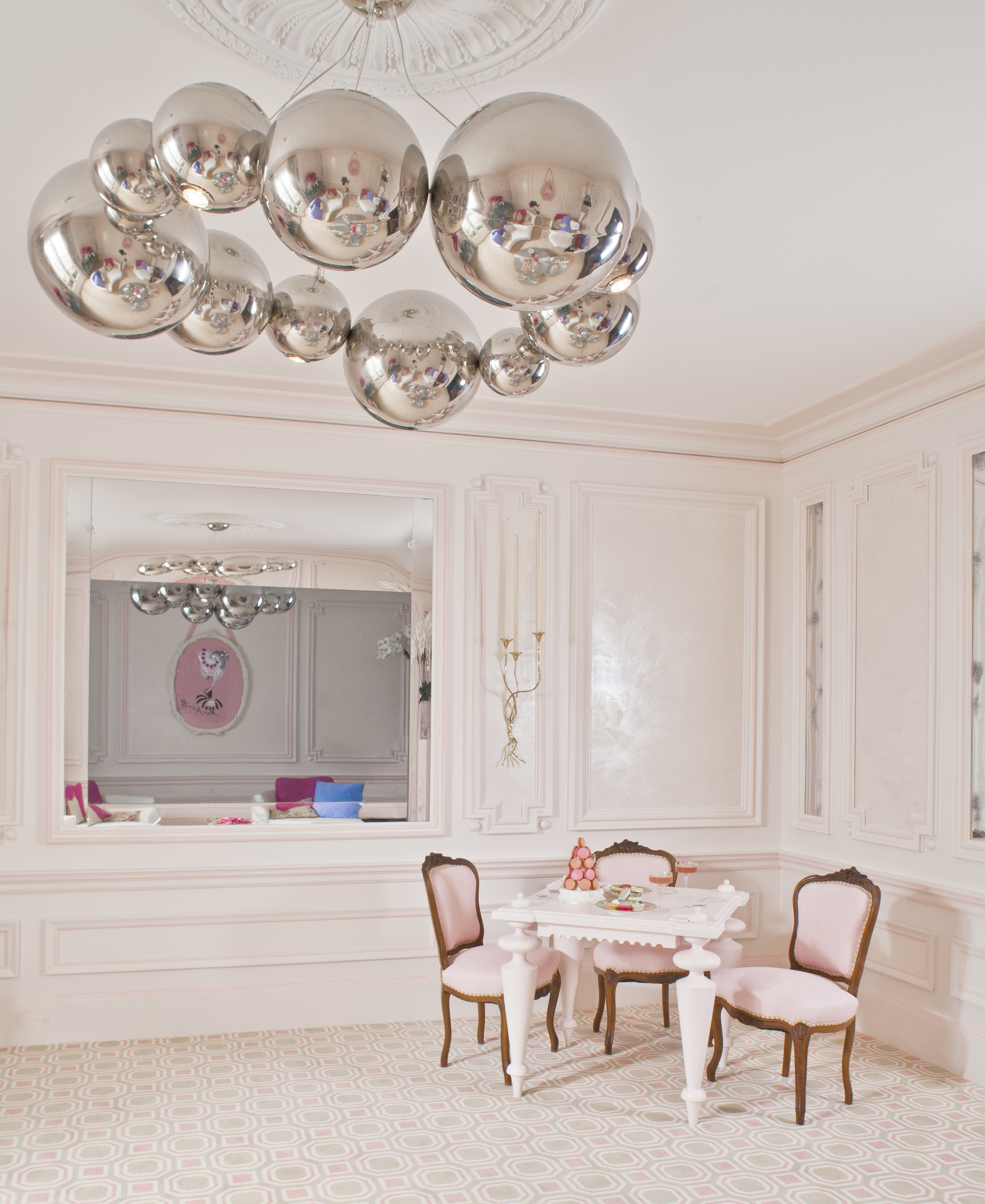
When Guillaume works on a color scheme for a client, how they want the room to feel is important to establish early on. They may communicate to him that they would like their new room to feel feminine, soft, and romantic. Guillaume might then employ a blushing palette of delicate pinks and roses in order to maintain the demure focus of the room.
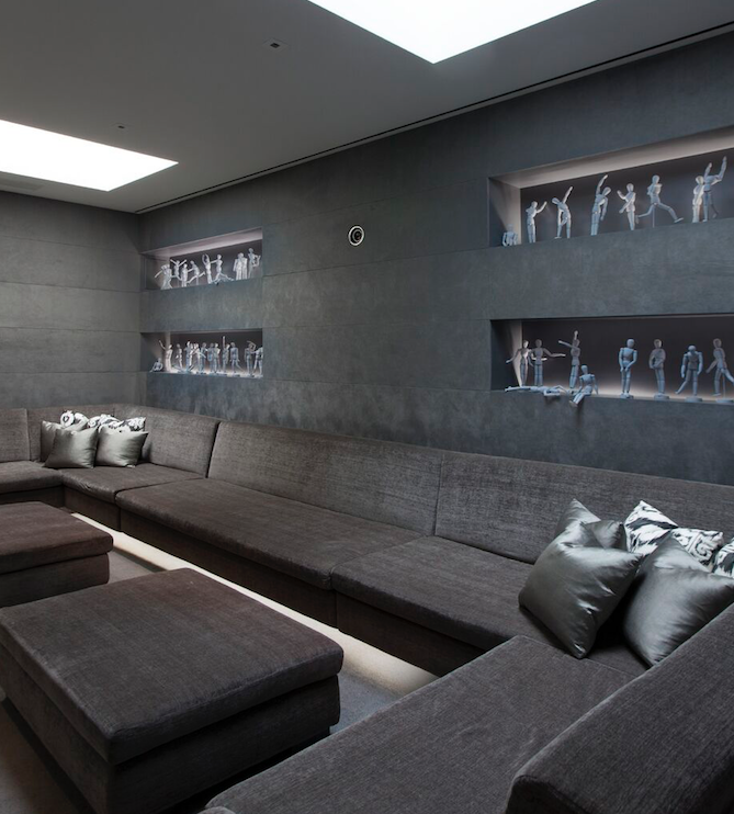
And what if a client wants their Living Room to feel less romantic and more elegant? Perhaps even a little sleek, with the impression of modernity, while still remaining a calming, tranquil space? A gentle palette of grays, silvers and deep blues may be in order. The playful addition of dolls, here, brings a playful edge to an otherwise stately room:
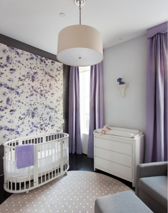
And what about a mix? Notice how this room feels equal parts elegant, feminine and tranquil:
With a little color research (and there are some wonderful resources out there, like Benjamin Moore’s color gallery) understanding the effects a hue has on our mood plays an important part in the initial stages of design. Of course, don’t feel like you have to be constricted by what the rulebooks say; if you adore a particular shade of orange, there’s no reason you can’t find a way of working it into your existing palette – it will likely cheer you up more than you expect! Finding ways to incorporate bold accents and unique pops of color is half the fun!
(Or you can just give Guillaume a call, and let him have the fun for you!)


Leave a Reply